I hope this reaches the UI/UX team eventually. The way the matter windows are set up is causing unnecessary frustration. Unless you are using a vertical monitor, the current layout makes no sense.
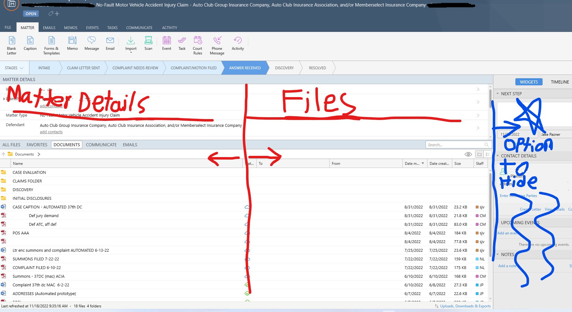
The files tab floats over the matter details and can only be moved vertically. This makes it so you can’t really look at both the matter details and the files at the same time. You have to drag the files tab all the way to the bottom get a good look at the matter details or drag the files tab all the way up to get a good look at all the files.
With the files tab dragged to the middle of the screen you can see only a few matter detail lines and files with out scrolling. Some of our older employees zoom in on their screens which makes this even worse as they can only see a few lines and files with out having to scroll. Not being able to simultaneously view the matter details and list of files is causing unnecessary frustration. .
Simply having the matter details and files arranged side by side with the option to move them horizontally would fix this. Additionally having the option to hide the widgets and timeline tab would also be appreciated as it would leave more room on the screen to view the matter details and files. Attached below is an illustration of a more preferable layout.


